
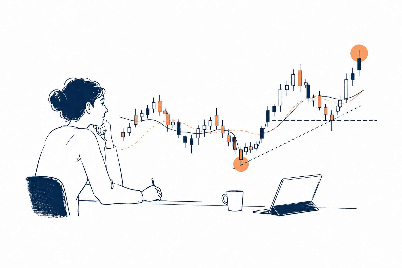

A crypto chart can make an uncertain market look deceptively precise. Candles rise and fall, indicators produce neat lines and support levels can be marked down to the nearest dollar. It is tempting to believe that enough technical signals will eventually reveal what happens next.
That is not really what crypto technical analysis is good at.
Its more useful role is to create a repeatable way of making decisions when the outcome is uncertain. Instead of asking whether Bitcoin or another cryptocurrency is about to rise or fall, technical analysis can help identify where a move is taking place, what could confirm it and, just as importantly, what would prove the original idea wrong.
That distinction matters in crypto because the market never closes and price can move violently when leveraged positions are forced out. Reading the chart therefore requires more than knowing what each indicator does. It requires understanding how the pieces fit together.
Start with the price before adding indicators
A common mistake among beginners is to open a chart and immediately add RSI, MACD, moving averages and several other indicators.
The result can look sophisticated while making the decision harder.
A better starting point is the price itself. Look for the basic structure of the market: is it forming higher highs and higher lows, lower highs and lower lows, or moving sideways between broadly defined boundaries?
This is the foundation of price action, the study of how an asset’s price behaves over time.
Support and resistance are part of that structure. Support is an area where buying interest has previously helped stop or slow a decline. Resistance is an area where selling pressure has interrupted an advance. These are better thought of as zones than perfectly precise lines, because markets rarely turn at exactly the same price every time.
That difference is more important than it sounds.
Suppose Bitcoin briefly moves below a previous low before recovering. A trader treating that low as an exact mathematical boundary might interpret the move as a clean breakdown. A trader working with a wider zone may see something different: a test of support that briefly pushed beyond the previous level before buyers returned.
Neither interpretation guarantees what happens next. The point is to avoid giving the chart a level of precision that the market itself does not have.
Volume helps separate a breakout from a move that only looks convincing
Price tells you what happened. Volume can add context about how much activity accompanied it.
A breakout above resistance with noticeably stronger trading activity may carry more information than a breakout that occurs on very little volume. Likewise, a decline through a significant support zone deserves a different reading when selling activity expands.
This is not a simple rule that says high volume equals a valid signal. Volume does not eliminate false moves. It is better treated as another piece of evidence.
That distinction is useful because technical analysis works in probabilities. A setup becomes more interesting when several independent parts of the market tell a broadly consistent story, not because one indicator flashes a green or red signal.
This is also where many charts become unnecessarily complicated.
More indicators do not necessarily mean more evidence
RSI, or Relative Strength Index, measures momentum. Moving averages help smooth price data and make trends easier to see. MACD compares moving averages to assess changes in momentum. ATR, or Average True Range, is designed to measure typical price volatility.
Each tool can be useful. Using all of them at once is another question.
If a trader places three momentum indicators on the same chart and all three point lower, that does not necessarily represent three separate reasons to sell. They may simply be showing different versions of the same underlying price movement.
A leaner approach can be more informative: use one tool to understand trend, another for momentum and another to understand volatility or participation.
Moving averages, for example, can help put the current price into a broader trend context. RSI can show whether momentum is strengthening or weakening. ATR can help estimate how much an asset normally moves, which becomes particularly relevant when deciding where a stop-loss should sit.
There is an important catch, though. Most technical indicators are based on historical price data. They are therefore, to some degree, lagging tools. They can help interpret a move that is already developing, but they cannot remove uncertainty about the next one. Technical analysis guides commonly emphasise this limitation and the risk of false signals.
That is why price structure should remain the reference point when indicators disagree with the chart.
Crypto volatility can invalidate a good-looking setup very quickly
Technical analysis becomes more complicated when leverage enters the picture.
A trader holding a leveraged long position is not simply exposed to the direction of Bitcoin. If the market falls far enough, the position may be forcibly closed because its collateral is no longer sufficient. That liquidation creates additional selling pressure, which can push the price lower and affect other leveraged positions.
The process can reinforce itself.
A chart may therefore show a sudden fall through several technical levels, followed by a rapid recovery. From a distance, it can look as though every support level failed at once. In reality, the move may have been amplified by forced selling rather than a smooth change in underlying market demand.
This is one reason crypto charts can contain unusually long wicks and abrupt reversals.
For an intermediate reader, the practical lesson is simple: a technically interesting level is not automatically a strong level. Market positioning and leverage can temporarily overpower the structure visible on a chart.
The real test of a technical setup is what would make it wrong
This is where crypto risk management becomes more important than finding the perfect indicator.
A stop-loss should not simply be placed at an arbitrary percentage because “5% sounds reasonable”. The more useful question is: at what price would the original market hypothesis no longer make sense?
Imagine that a trader believes a cryptocurrency is holding a support zone and expects a recovery. If the price decisively breaks below that structure, the reason for the trade may have disappeared.
The stop should therefore relate to that invalidation point, while also accounting for normal volatility.
This creates another important distinction. A wider stop does not automatically mean greater risk if the position size is adjusted accordingly.
For example, suppose someone is only willing to risk £100 on a trade. A setup with a relatively tight stop allows a larger position, while a more volatile asset may require a wider stop and therefore a smaller position. The objective is not to force every trade into the same percentage distance. It is to keep the potential loss within a predefined limit.
In other words, position size should adapt to the market, rather than asking the market to fit an arbitrary position size.
That is one of the most practical uses of technical analysis: it gives risk management a structure.
Technical analysis cannot see what has not happened yet
There is one limitation that no indicator can overcome.
A chart reflects the information that has already reached the market. It cannot know about an unexpected central-bank decision, a regulatory announcement, a major exchange problem or another event that has not yet been priced in.
A technically strong setup can therefore fail suddenly without the analysis being meaningless.
This is not a contradiction. Technical analysis deals with probabilities based on available market behaviour. New information can change those probabilities.
The mistake is assuming that a pattern is supposed to predict the future with certainty. It is better understood as a scenario with conditions attached.
For a bullish setup, the question is not simply “Can the price go up?” It is also “What evidence would support that idea, where would it stop making sense, and how much capital am I prepared to put behind it?”
That way of thinking turns the chart from a prediction machine into a decision framework.
The useful part of crypto technical analysis happens before the trade
The strongest application of crypto technical analysis is not discovering a magical combination of indicators.
It is creating a process that remains usable when the market becomes noisy: establish the price structure, identify meaningful zones, look for confirmation, account for volatility and define the invalidation point before putting capital at risk.
The chart will never tell you exactly what happens next. What it can do is make the decision less improvised.
And in a market where a few violent candles can erase a carefully constructed thesis, knowing in advance when to stay, when to exit and how much to risk may be more valuable than being right about the next move.